
At Grammarly, it’s paramount to ensure designs are not only visually appealing but also accessible to all users. Our designers craft user experiences with care, but the transition from design to development can be fraught with challenges. How can we ensure our meticulously designed layouts and interactions translate seamlessly into a final product that’s both beautiful and inclusive? Annotations are the key.
Think of annotations as a bridge between design intent and development execution. By documenting accessibility considerations directly within design files, designers provide developers with crucial insights into how elements should function for users. This ensures that carefully considered features like keyboard navigation and screen reader information are fully and clearly conveyed, resulting in digital experiences that are truly accessible to everyone.
What are annotations?
Let’s align on what we mean by annotations. Annotations move beyond the implied messaging within a design and are explicit in intent. This might be a new way of thinking about annotations for some teams.
Likely, most designers have done some form of annotation in their designs to convey details about color, typography, layouts, and sizing. These annotations generally point to parts of a design and describe them with text.
Designers may also be familiar with annotations in Figma’s Dev Mode feature, which provides tools for documenting, with pixel-level precision, sizes, colors, the spacing between buttons, and the exact fonts to be used. Developers can reference these annotations as they build the design.
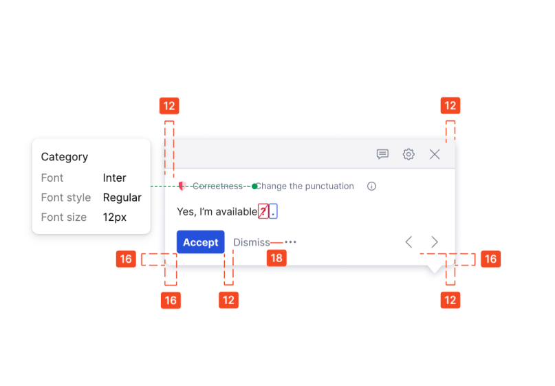
These annotation specifications tend to focus on the appearance of a design experience. But it’s essential to go beyond appearance and communicate the design intent. Annotations bring design and development together to convey information crucial to an accessible experience. When it comes to accessibility, if designers don’t fully describe their intent—how an interaction experience should work for screen reader users, how actions should be labeled, and more—then developers may leave something out.
The “something is better than nothing” approach
You may ask yourself, “But what if I’m not an accessibility wizard?” That’s OK! The most important thing is to start annotating, even if you don’t have all the technical knowledge. You don’t need to have perfect annotations; you just need to have annotations.
Here are some tips for annotating when you’re not familiar with accessibility and development.
Describe the experience
Focus on describing in detail the user experience you want to create. How should the interaction behave when someone is navigating with just a keyboard? What should a user see or hear when content changes? You don’t need to worry about the mechanics of the implementation—the job of annotations is to convey how something should function for the user.
Ask questions
Don’t be afraid to ask your developers for help. They can clarify technical aspects, suggest how they can implement your design, or help you shape an alternative approach. This partnership will help you understand what’s possible on the platform. If your organization has an accessibility specialist, reach out to them to clarify a designed experience. Don’t work in isolation!
Use plain language
Avoid jargon or technical terms that you may not understand. Use simple, clear language to describe your design decisions. The person reviewing the design and those who implement it might also not understand the technical terms or could misinterpret their meaning.
Be visual
Annotations don’t need to be text-only. Use screenshots, diagrams, or even hand-drawn sketches to illustrate your ideas. The goal is to make your intent as understandable as possible for the teams that will implement and review your designs.
Rinse and repeat
If a similar or identical pattern already exists, reuse what you already documented. If standard platform interactions exist, reference them in your annotations.
Iterate
Annotations are not set in stone. Revise and refine them as you uncover new information and gain a deeper understanding of the problem and its context. As your work proceeds, you will probably know better what’s needed.
Tools we use
At Grammarly, one tool we’ve found particularly helpful for annotating is Stark. The Stark plugin integrates directly with Figma and provides a simple, intuitive interface for adding annotations.
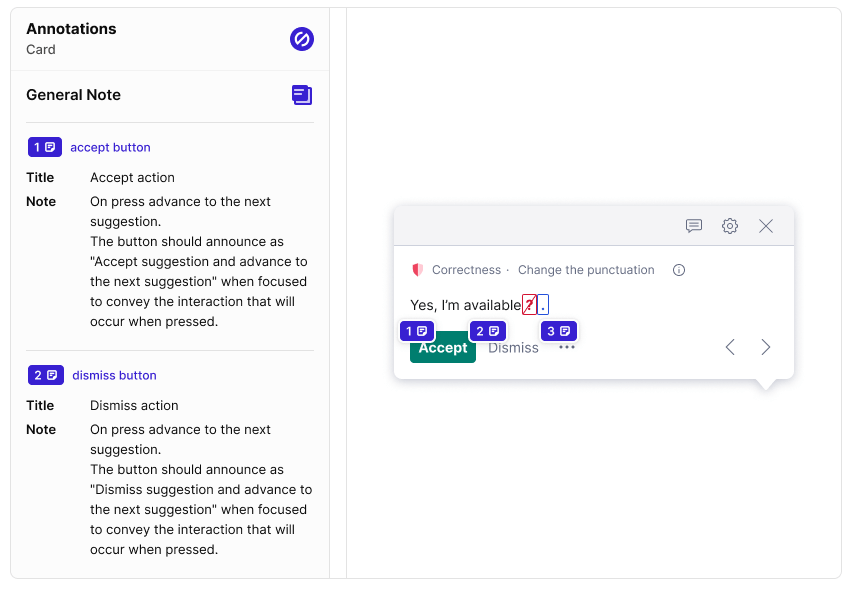
What we love about Stark:
- Overall workflow: Stark makes it easy to add, edit, and organize annotations within design files. Designers and developers can reference the plugin to find an annotation. Within our process, we advise designers to use the General Note function; this encourages us to step away from the technology used to implement and, again, focus on describing the intent.
- Evaluation tools: Stark offers powerful tools for checking the accessibility and usability of designs, which helps catch potential issues early on. The Vision Simulator, in particular, is a great way to check whether your work is visually readable to all users before you send it off to developers.
- Collaboration: Stark allows designers and developers to collaborate on annotations, encouraging a shared understanding of the design intent.
But truly, use what works for your team! Simple annotation components can also meet your team’s needs.
Annotations make for smoother handoffs
Embracing annotations is about empowering yourself as a designer to advocate for accessible and inclusive user experiences. By taking the initiative to document your design intent, you foster a collaborative environment where developers are better equipped to bring your vision to life—and make it accessible to all.
Start small, focus on communicating your design vision clearly, and watch as annotations transform your approach to accessibility. Your designs will not only be more faithfully implemented but will also resonate with a broader audience.
At Grammarly, we design experiences that improve communication for millions of people around the world. Interested in joining our team? Check out open roles here.


