The Grammarly Design team uses Figma to design the product experiences that help teams communicate and do their best work. Our design system team uses features like variables to build components that reflect what’s available in code. This allows us to enable a smooth handoff between design and development and scale consistent design across the product.
Before variables, we only had styles in Figma to ensure consistency across design files. However, each style is limited to storing a single value, while a variable can be associated with multiple color, string, number, or Boolean values. These values can then be assigned to different variable modes to easily change the look of any design.
Switching between light and dark modes has become fairly common in user interfaces, so variable modes might seem relatively straightforward at first glance. But variable modes behave differently from everything else in Figma, particularly in the context of parent frames and the components inside them. We usually think of components as being entirely encapsulated—separated from what’s going on in the rest of the frame—but when it comes to variables, that assumption doesn’t hold. Instead, there’s inheritance at play.
Our design system team confronted the complexities of variable mode inheritance when designing the component. A popover is a graphic user interface element that pops up and shows extra information or choices when a user triggers it. We wanted the popover’s border to disappear in light mode and be visible in dark mode. This small design requirement taught us three things about how inheritance works with variable modes in Figma.
Lesson 1: Child elements inherit the mode of the parent container
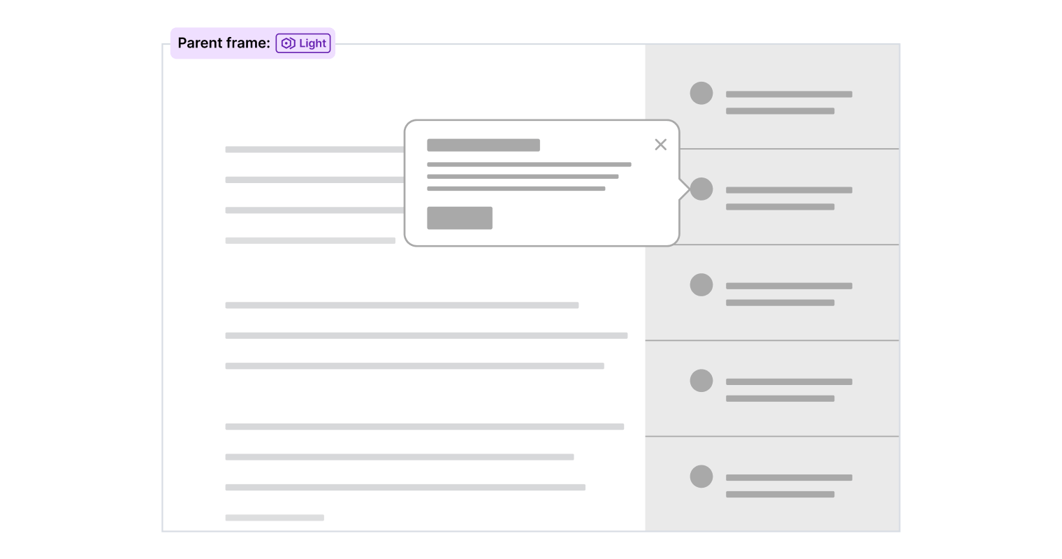
Typically, a variable mode is set at the parent frame level and controls how all elements within the parent frame display. For example, if a page should display in light mode, that variable mode only needs to be applied to the outermost frame. All components and elements within the parent frame inherit the light mode setting, causing the visual aesthetic to change appropriately.
Lesson 2: Child elements can be scoped to a mode independent of the parent container
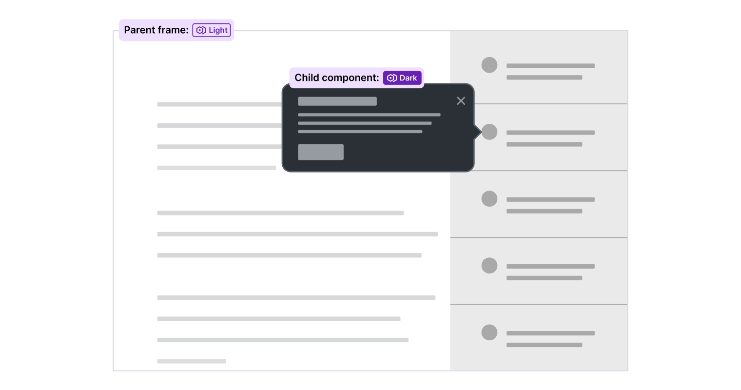
The popover in our design system is different from other components because it uses dark mode colors regardless of whether the parent frame is scoped to light or dark mode. We achieve this by applying the dark variable mode directly to the component, instead of allowing the parent frame’s variable mode to determine its style. That means the component will maintain a dark background even if placed in a parent frame that’s scoped to light mode.
How can we change a component’s behavior based on its parent’s variable mode?
We now had a popover component that remained in dark mode regardless of the mode of its parent.
Here’s where we ran into an interesting problem. We wanted the popover to look a bit different depending on the mode of its parent. Specifically, when the parent frame is set to dark mode, we wanted to add a border around the popover to ensure enough contrast for accessibility reasons and to prevent it from blending into the background. When the popover is placed in a parent frame scoped to light mode, the border is an unnecessary design detail, and we wanted to remove it. The challenge became changing the visibility of the border without relying on designers to do it manually, which led us to explore a few options.
Option 1: Use component variants
The simplest solution seemed to be using component variants with a Boolean property to remove the border. However, the popover component already had 24 variants to accommodate different content layouts and pointer positions. Doubling the number of variants isn’t ideal from a maintenance standpoint. It would also mean that designers would have to hide the border manually. This option was quickly dismissed.
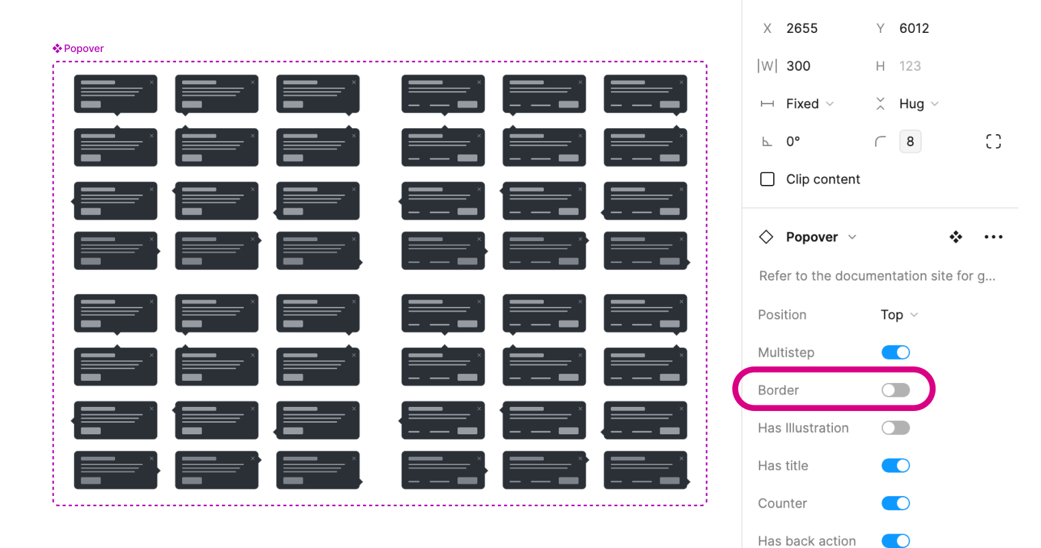
Option 2: Use a unique border variable
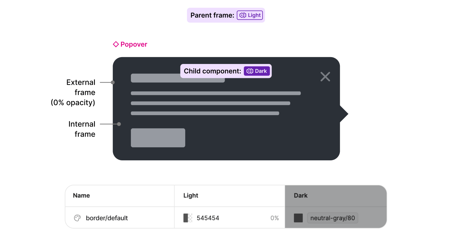
Next, we created a unique variable to control the border by setting the opacity to 0% in light mode. When building components, we try to minimize complexity by using nested frames only when necessary. For the popover, the border and background colors are applied to one parent frame wrapping the component. But because we’re setting the component to use dark mode, any light mode values, including the unique border variable, aren’t inherited. This became evident when the popover was placed into a parent frame set to light mode, and the border didn’t disappear. While this option failed, it did lead to the solution of using variable mode inheritance by properly structuring the component frames.
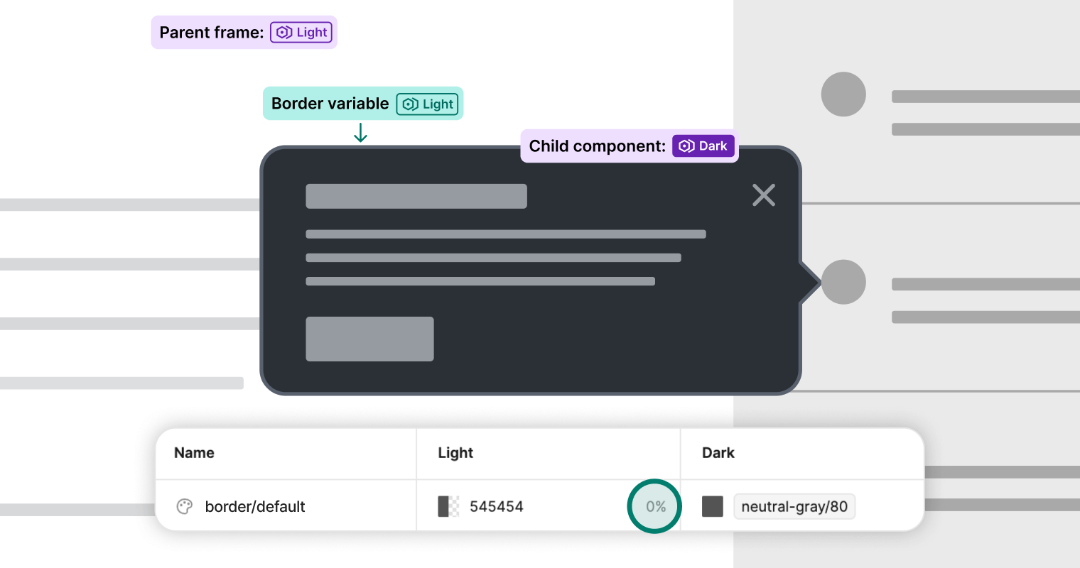
Lesson 3: Use nested frames to “hack” variable mode inheritance
We’ve already established that child elements will inherit the variable mode of the parent frame if a mode isn’t scoped at the component level. This is how CSS inheritance works, and we can apply the same concept in Figma, too. So, we had the idea that we could automatically control the visibility of the border by adding another external frame around the component that would purely handle the border. This new frame would have no variable mode applied to it.
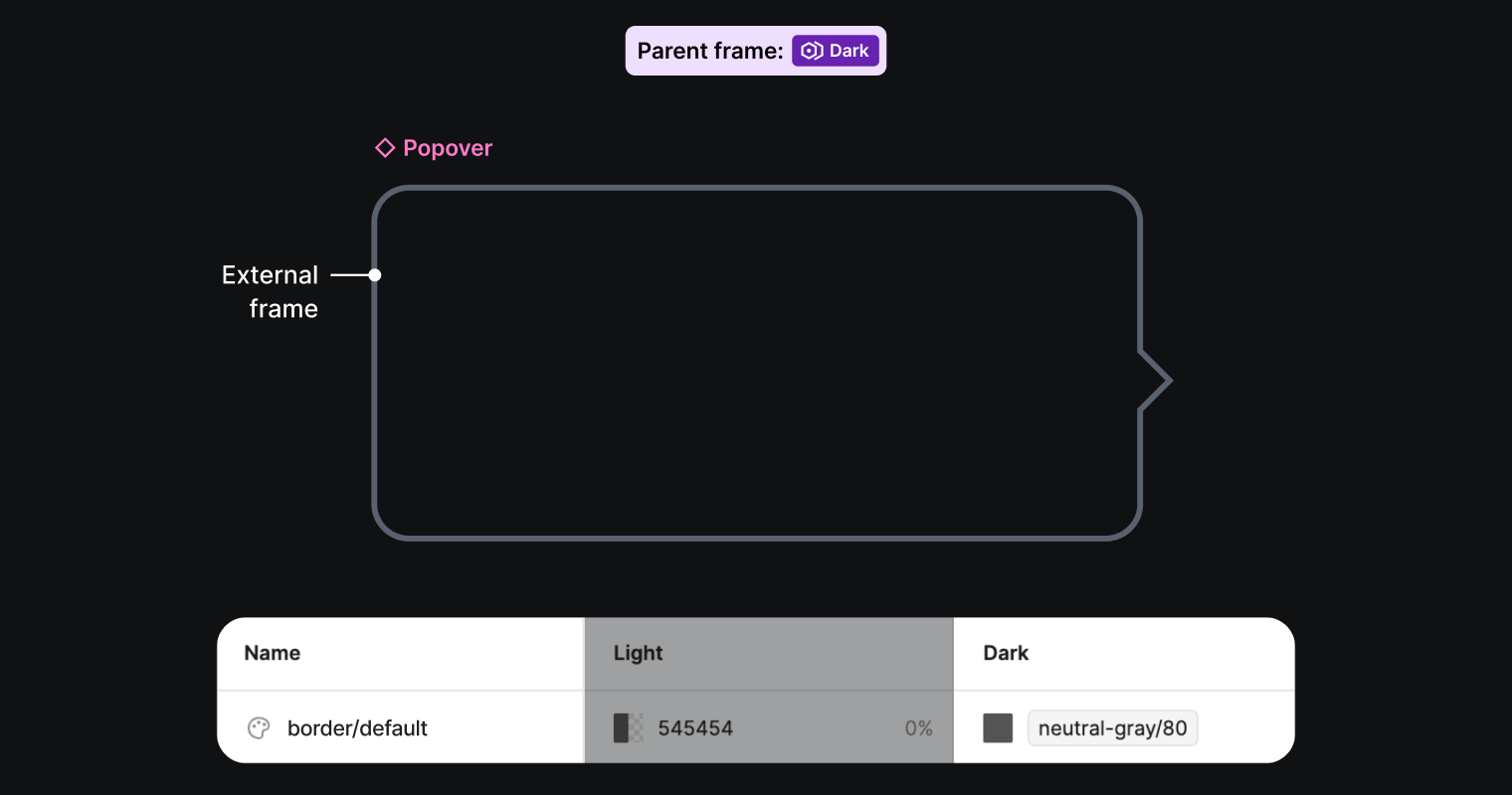
The popover is now divided into two frames: an external parent frame responsible for the border, and an internal child frame representing the rest of the popover component. We can now scope the internal frame to dark mode, making the background color, text, buttons, and icons display as expected using dark mode colors, with no impact on the border visibility.
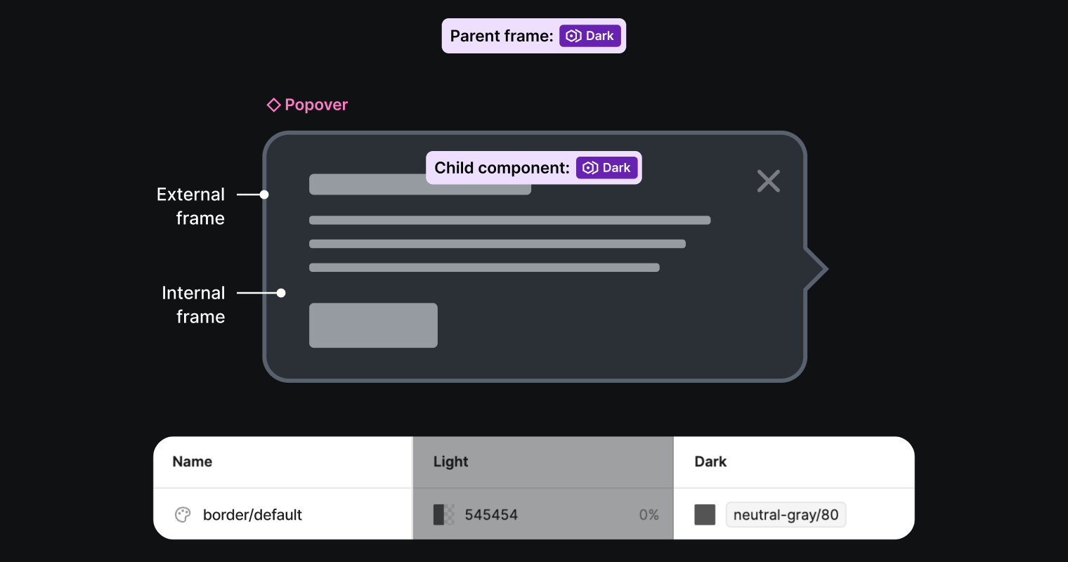
We keep the special border variable set to 0% opacity from option 2, which will hide the border in light mode. We don’t need to make any manual changes to the external frame that’s responsible for the border, because it will inherit the parent frame’s variable mode automatically.
Understanding the inheritance of variable modes gives us another way to build components that are easy to use and behave like their counterparts in code. Visit the Figma documentation for more information about applying variables and modes to your designs.
This article originated as a presentation at Friends of Figma San Francisco along with Anthony DiSpezio, Designer Advocate at Figma. If this piece was interesting to you, you might like the kind of work that we do on Grammarly’s design team. Check out our open roles here.


