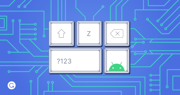
The Grammarly app on both Android and iOS is a native keyboard. The motivation behind building a keyboard, as opposed to a traditional mobile app like a text editor, is the same principle behind Grammarly’s browser extension: the writing assistant should be available wherever the user is writing. The Grammarly Keyboard on Android is used over 70 times per day by the average user, and it meaningfully impacts how people communicate using their phones.
The decision to build the Grammarly app as a native keyboard has introduced our team to some fascinating and complex problems in mobile app architecture, UX, performance, and testing. This blog post will look at Android in particular, where the Grammarly app is unique—in that unlike most Android apps, it’s not an activity or a fragment. The UI is constrained and constantly changing. Each keypress on the Grammarly Keyboard triggers a number of concurrent events. The keyboard looks for suggestions from its on-device models, and as that request is being processed, it also checks with the backend to get an in-depth analysis of the text you typed. Another thread fetches a list of synonyms for the current word and shows them in the “suggestion strip” above the keys. All of this happens in 10s of milliseconds. If this sounds interesting, read on for a peek into what building a keyboard app is like.

Android keyboards
A keyboard on Android is called an IME, or input method editor. The Android documentation gives a good overview of implementing an IME, so we’ll just briefly mention the main points. On Android, a keyboard is an app whose state and visibility is controlled by a service component called the InputMethodService. The keyboard also implements a KeyboardActionListener, whose primary job is to handle touch events like typing and gestures and then send updates to the text editor through the InputConnection interface.
When it comes to features, most keyboards have a strip above the keys where predictive suggestions are displayed to help the user type faster. And to improve accuracy, keyboards use intelligent models to predict the character that is most likely to have been touched by the user. Finally, to implement autocorrect, most keyboards also attempt to predict the word the user is trying to type.
Additional requirements for Grammarly
Like most Android keyboards, Grammarly runs its own autocorrect and next-word prediction models; we also wrote our own gesture-recognition algorithm to give users the option of swipe-to-type. But our broader goal was to go beyond the basic features described above to help the user write better. To this end, we wanted to provide deeper writing suggestions by surfacing the same kinds of alerts users receive from Grammarly’s browser extension. Where appropriate, we also wanted Grammarly’s keyboard to suggest good synonyms for the current word.
To do all this, our keyboard draws from two sources of information: (1) fast models stored on-device as part of the app for autocorrect, next-word prediction, synonyms, and gesture typing; and (2) Grammarly’s backend, which performs deeper sentence- and paragraph-level analysis. By combining these sources, the keyboard is able to present the most relevant writing suggestions to the user at all times.
Focus areas for building Grammarly’s keyboard
Below, we outline some of the interesting complexities we’ve faced while building an app that needs to serve as both a smart writing assistant and a fast, reliable IME. We’ll explore a few of these topics in more depth in future blog posts.
Enabling micro-interactions at each keypress
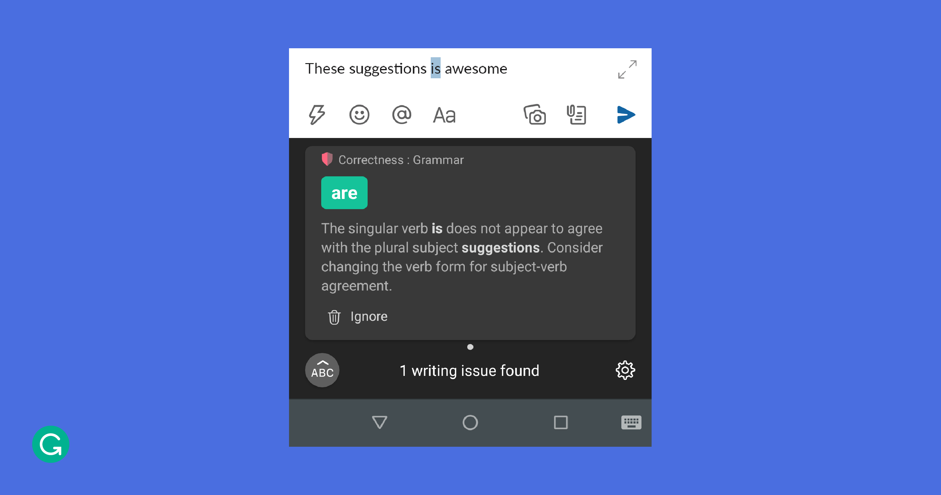
For the Grammarly Keyboard, we had to find a way to fit more information into an already small and uniform space. It’s important for users to see Grammarly’s suggestions, but at the same time, information shown while typing can quickly become overwhelming or distracting. We settled on a UX where the suggestions from the backend appear as alert cards next to the Grammarly logo on the suggestion strip, stacking up if there are multiple cards. To allow users to see additional details for each alert, we introduced a revision view that replaces the keyboard layout and shows cards with descriptions about what changes might be applied to the text.

With space being so limited, we played with another dimension: time. When the user has stopped typing for more than a few seconds, the keyboard’s top strip changes from showing autocomplete or next-word predictions and displays synonym suggestions instead.
Developing a state machine for UI views
The UI for a keyboard is very unassuming. It mainly consists of a view that shows different suggestions above the keyboard and another view containing the keyboard layout itself. Even though a keyboard might seem static compared to a typical app, the UI is constantly in flux. A keyboard can’t create new screens and views. Instead, depending on the event, views are either switched out or overlaid, often in many places at once. For example, when a user taps on the symbols key, the keyboard layout switches by replacing the views for the alphabet keys with new ones, and when a user taps on the Grammarly logo the keyboard layout switches to the revision view. Trajectories for gesture typing are drawn on top of the keyboard layout.

Grammarly’s suggestion strip has more moving parts than most. Its view hierarchy consists of the following: the Grammarly logo, autocorrect or next-word suggestions, alert cards, synonyms, a badge on top of the Grammarly logo that displays the number of alerts in the stack, and important user prompts. All of these views have to coexist seamlessly in the suggestion strip, switching in and out or overlaying as needed, with specific transition animations. We designed a state-driven architecture to make the UI fluid and delightful. The layout inspector output below shows the number of views that make up the suggestion strip.

Managing multiple pipelines and threading
The constant flow of suggestions and alerts to the suggestion strip is fed by different pipelines that get predictions from the on-device models and the Grammarly backend. At each keypress, a complex sequence of events unfolds across multiple threads.
In the main thread, the keypress gets committed to the editor and appears in the text box. But in parallel, another thread gets next-word or autocorrect predictions. If the keypress was a regular character, like “g,” the models try to predict what word the user is currently typing, like “great.” If it’s a space or another separator, the models try to predict the next word or words, like “job” after “great.” A different thread fetches synonyms for the last typed word, which will be shown if the user pauses for more than a few seconds.
These various suggestions go through an RxJava pipeline and connect to the view models for the suggestion strip’s view hierarchy. All of this happens in about 20 milliseconds.
But that only covers what’s happening on-device. Meanwhile, a separate thread creates diffs of the text and sends them to the back-end in batches. The keyboard uses chains of Deltas, an expressive format for describing insert, retain, or delete operations, to communicate what has changed. As the backend receives these changes, its models provide additional writing suggestions that might be at the sentence or even paragraph level. These alerts are what stack as cards next to the Grammarly logo in the suggestion strip.
The challenge with managing these different pipelines is similar to maintaining cache coherence. With various threads manipulating the data at once, we need to be careful to avoid corruptions. If the text in the editor is modified in the same place the backend was suggesting a change, that change needs to be invalidated. If the text preceding a suggestion is modified, that suggestion’s bounds need to be shifted to the right to accommodate. Otherwise, the suggestion could be applied to the wrong section and corrupt the text.
Modifying the text
Most keyboards keep track of only the last few words as the user is typing. However, since Grammarly’s back-end suggestions could apply to any part of the text, the keyboard needs to handle modifying any part of the user’s text. This is particularly challenging because the changes to the text can happen in any order and from any source: individual keys, suggestions, or back-end alerts.
To handle these changes, the keyboard needs to have quick access to the user’s entire text. While it is possible to get the text from the editor with the InputConnection interface, it’s an IPC call, which is expensive. To avoid having to make these calls frequently, the keyboard maintains a cache of the text in the editor. Again, careful rules must be applied to avoid corrupting the text. These include reloading the cache when the user is not typing or when the keyboard fetches synonyms from the on-device models after the user has paused for a few seconds.
Ensuring snappy performance
Keyboards need to be very fast. Any code change that adds even a few 10s of milliseconds to any part of the call flow will result in visible lag and degrade the user’s typing experience. We are constantly trying to optimize the call flows to make the user experience as snappy as possible.
We think of performance on two fronts. The first is keyboard start time. The keyboard is an always-running service, as opposed to an app that the user can kill by swiping it out of Android’s Recently Used Apps list. If the keyboard process does get killed, the OS immediately restarts it. A cold start (when the keyboard app reboots from scratch) is an expensive operation, and while the on-device models are being initialized, the user might see empty placeholders for suggestions. If the keyboard is running but major parts of the app need to be reinitialized, this is called a warm start, and it can also be costly. All other keyboard sessions are hot starts, which should be as fast as possible. Given that the OS decides when cold and warm starts occur, our goal is to speed up the keyboard start time across all these scenarios.
The second performance metric we focus on is keypress latency. When the user presses a key, multiple pipelines run to generate suggestions, and various views transition in and out of the suggestion strip. The time for all of this activity to complete on the UI thread is what we generally think of as the keypress latency. It translates to how responsive the keyboard feels for each keypress.
This is an area that we are currently focusing a lot of our efforts on, and we aim to achieve significant gains in the coming months. The way we are tackling this is by reducing the utilization of the UI thread and minimizing the context switches between different threads in the text processing pipelines. During profiling, we’ve identified some time-consuming operations on the UI thread that sometimes delay it from handling the next incoming keypress. We also discovered that when we generate a lot of on-device suggestions, the allocated memory increases rapidly, causing frequent garbage collection that can hamper the UI performance.
Going beyond manual tests
Testing a keyboard is a challenging (but super interesting!) problem. The keyboard view is seemingly static, but the keyboard can be in one of many states, depending on the user’s text, the cursor’s position, or the character before or after the cursor. The Grammarly Keyboard also has suggestions from the backend that add to the complexity. Each new writing feature we add can non-linearly increase the number of things to test.
Our testing strategy includes a combination of manual, unit, instrumentation, and UI tests. Instrumentation tests for a keyboard are tricky because the InputMethodService doesn’t lend itself to use through a ServiceTestRule. We’ve found that instrumentation tests don’t get a handle to the local binder of the InputMethodService (these tests typically need that handle to call the service’s APIs). So we are moving toward more unit and UI tests. Popular UI testing frameworks are great at testing the app that’s in focus; however, we’ve found that they don’t support testing the IME itself. So we use Android’s built-in UI Automator. To keep the duration of the test cycle short, we run multiple tests in parallel using Fork.
Further challenges await
We’ve gone through a broad overview of how the Grammarly Keyboard works, along with the various areas of focus for our team: from figuring out how to optimize the UX for a small screen, to managing on-device and back-end pipelines with multi-threading, to determining how to test an Android app that doesn’t behave like a normal application.
In subsequent posts, we’ll dive deeper into specific topics, such as internal pipelines, view orchestration, and performance optimization. We are exploring a few architecture patterns that we can apply to the keyboard to make it more robust and easier to maintain. We are trying to design our own architecture that is state-driven by following good design principles and borrowing ideas from paradigms like Model–view–viewModel (MVVM) and Model–view–intent (MVI).
If you are interested in solving complex architecture issues, optimizing performance, or designing an amazing UX, we would love to talk to you. Grammarly’s Android team is a relatively small team right now—and we are looking for people who can join us in building an awesome writing assistant.


