
Approaches to web development are always evolving. That’s why at Grammarly we’ve sometimes adopted new open source libraries—and other times we’ve built our own to solve the unique challenges we face. For instance, the Grammarly Editor has a complex UI structure, and being data-driven as a company means we want to support many simultaneous experiments without creating a mess of spaghetti code.
A few years ago, we released Focal, a framework for immutable and observable state management with TypeScript. Now we’re happy to announce a new UI framework we’ve been busy building and testing for the last year: Embrace. Embrace is a type-safe, declarative UI engine written on top of React and Focal. It lets you compose UI components without having to write boilerplate code or worry about routing states. You can represent your UI as data so that it’s easily patched, allowing you to run hundreds of front-end experiments easily.
We hope you’ll go to GitHub and try out Embrace for yourself. This article explains our motivation for building this library and gives you some examples of how to use it. We hope this background helps you and your team understand whether Embrace is a good fit for your use cases.
A brief history of the Grammarly Editor architecture
The Grammarly Editor is our browser-based text editor where users can create and edit documents, adjust their settings, and manage their subscriptions. Back in 2016, we rewrote both the UX and architecture for the Grammarly Editor so it could handle new kinds of features for our users. As Grammarly grew, we learned more about how our users worldwide were using our product for different kinds of communication—from academic assignments to personal emails to professional writing. There’s so much more to good writing than proper spelling and grammar, and so we brought users an update that included AI-powered writing suggestions for correctness, clarity, engagement, and delivery.
The Grammarly Editor needed to be redesigned to support these capabilities. We changed our tech stack from Vue.JS/JavaScript to React/TypeScript, and with a strong belief in object-orientation and two-way data binding, we designed Focal to handle state management for our new architecture.
import { Atom,  bind,  F }  from  '@grammarly/focal'

const TwoWayBindingComponent =
({ state }: { state: Atom<{ text: string }> }) => (
  <F.input
    {...bind({ value: state.lens('text') })}
    type="text"
  />
)
Here is an example of two-way data binding using Focal.
As our team grew and the Grammarly Editor continued to evolve, we began to notice that two-way data binding has its issues:
- Components can become hard to reuse because of the tight two-way coupling between a component (or view) and its state (or model).
- By doing “in-place” updates of the state, we lost the ability to react to user actions in a more declarative way. Filtering, throttling, and logging user actions became more challenging.
From two-way data binding to model-view-intent
To address these issues, we drew from the model-view-intent (MVI) pattern for a new approach to state management. With this approach, a React component (the “view”) would listen for state updates (implemented as Focal Atoms) to re-render. When it received a user event, it would emit an explicit action (the “intent”). These actions are handled by a state manager (the “model”) that encapsulates a piece of app state and sends out state updates, continuing the cycle.

Simple MVI mental model
Let’s rewrite the sample component from above using this MVI approach:
interface Actions {
  kind: 'updateText'
  text: string
}

interface State {
  text: string
}
Interfaces for a component’s actions and state
const ActionEmittingComponent = ({
  state,
  actions
}: {
  state: ReadOnlyAtom<State>,
  actions: Rx.Observer<Actions>
}) => (
  <F.input
    value={state.view('text')}
    onChange={e => action.next({
      kind: 'updateText',
      text: e.currentTarget.value
    })}
  />
)
The same two-way binding component from before is rewritten to use read-only state and emit actions.
class StateManager {
  constructor(
    public state = Atom.create<State>({ text: '' }),
    private _actions = new Rx.Subject<Actions>()
  ) {
    const handleAction =
      (a: Actions) => (s: State) => ({ ...s, text: a.text })
    this._actions.subscribe(a => state.modify(handleAction(a)))
  }

  get actions(): Rx.Observer<Actions> {
    return this._actions
  }
}
The state manager (model) that does updates
const Root = () => {
  const sm = new StateManager()
  return <ActionEmittingComponent
            state={sm.state}
            actions={sm.actions}
         />
}
“Rendering” the component by providing it with the state and the place to emit actions to
Today, most of the Grammarly Editor is implemented using this MVI-based architecture, which has many benefits:
- The state management and view logic is nicely decoupled. Views can be reused as long as the corresponding data is provided, and we can iterate on state management without affecting the view logic.
- Simple abstractions (Rx Observables) and small interfaces (action messages) make it easier to compose UI pieces together.
However, we quickly discovered that this approach came with its own new set of challenges.
New challenge: Nesting components
When implementing the Grammarly Editor features as described above, we soon found ourselves writing a lot of boilerplate and wiring code to nest and compose components.
As each component’s state is nicely abstracted away behind a read-only Atom interface, combining and nesting such components meant that we often had to make the resulting Atom more complex—and then write the code that “selects” part of it:
interface State1 {
  one: string
}

const Component1 = (_props: { state: ReadOnlyAtom<State1> }) => (
  <F.div>{state.one}<F.div/>
)

interface State2 {
  two: string
}

const Component2 = (_props: { state: ReadOnlyAtom<State2> }) => (
  <F.div>{state.two}<F.div/>
)

const Component3 = (_props: { state: ReadOnlyAtom<{ one: State1, two: State2 }> }) => (
  <div>
    <Component1 state={props.stae.view('one')} />
    <Component2 state={props.stae.view('two')} />
  <div/>
)
Component3 needs to provide state for both Component1 and Component2.
Although Focal has some nice utils to make it easier to write code like this (e.g., the view function above), we still need to manually implement this state routing, which only became more complex with more levels of nesting in the UI.
The same problem occurs with actions:
interface Actions1 [
  kind: 'one'
}

const Component1 = (_props: { actions: Rx.Oberver<Actions1> }) => (
  <div></div>
)

interface Actions2 {
  kind: 'two'
}

const Component2 = (_props: { actions: Rx.Oberver<Actions2> }) => (
  <div></div>
)

const Component3 = (_props: { actions: Rx.Oberver<Actions1 | Actions2> }) => (
  <div>
    <Component1 actions={props.actions as Rx.Observer<Actions1>} />
    <Component2 actions={props.actions as Rx.Observer<Actions2>} />
  </div>
)
Component3 needs to provide observers for actions coming from both Component1 and Component2.
To avoid writing code like this, we often found ourselves combining all the types of actions into one union type and that we would pass to all the components, which technically works and eliminates a lot of boilerplate—but at the cost of introducing more coupling and breaking the encapsulation of different components.
New challenge: Side effects
When working within our MVI approach, we’d often experience an unpleasant surprise: Even though we’ve nicely decoupled state from our UI components, React still makes it extremely easy to introduce a side effect, which often results in bugs and code that is hard to understand.
const UndercoverEffectComponent = ({
  state,
  actions
}: {
  state: ReadOnlyAtom<State>,
  actions: Rx.Observer<Actions>
}) => {
  React.useEffect(() => console.log('I can do what I want!!!'))
  return (
    <F.input
      value={state.view('text')}
      onChange={e => actions.next({
                       kind: 'updateText',
                       text: e.currentTarget.value
                     })}
    />
  )
}
Here’s an example of a component that produces a side effect without emitting an action.
New challenge: Experiments
At Grammarly, we rely heavily on data when developing new features, which means we do a lot of A/B testing. We even built our own custom experimentation framework that our teams use internally to manage their A/B tests.

Here were two versions of a new feature—which gives Grammarly Premium users the option to accept multiple suggestions at once—in the Grammarly Editor.
How do we implement experiments like these in the Grammarly Editor, assuming that we have a way to tell which “feature flags” are enabled for a specific user? We could use if/else statements:
const ComponentWithExperiment = ({
  state
}: {
  state: Atom<{ features: { fancyComponent: boolean } }>
}) => (
  <F.Fragment>
    {pipe(
      state.view('features'),
      Rx.map(f => {
        if (f.fancyCompenent) {
          return <FancyComponent />
        } else {
          return <NormalComponent />
        }
      })
    )}
  </F.Fragment>
)
This if/else code renders different versions of a component based on a feature flag.
But while code like this might work in the short term, it introduces problems that become more visible as the number of experiments grows:
- It’s hard to maintain the code because anyone who works on it now needs to keep in mind two (or even more) possible behaviors.
- As the number of experiments increases, the number of potential UIs grows exponentially. If there’s a conflict somewhere, which becomes increasingly likely, the issue could go uncaught because it’s very hard to test all the possible scenarios.
- If we modify the code directly like this to add experiments, multiple teams may need to be involved to run an A/B test (for example, if the Growth team wants to run an A/B test, they need to introduce a change in the Grammarly Editor code, which is maintained by the Grammarly Editor team). Needing to coordinate across teams to make a change tends to introduce delays for delivering new features to users.
Evaluating solutions
As the Grammarly Editor team reflected on these challenges, we developed some requirements for a possible solution:
- Offer easier ways to compose components via automatically deriving more complex state and action types, as well as managing state updates and action routing
- Provide stronger guarantees around side effects—if a component uses a read-only state and emits actions, then it should not be possible for it to introduce a side-effect without emitting an action
- Scale to support many experiment definitions at once, so that running A/B tests is manageable and easy to maintain
We looked at several open source solutions for this. We were influenced by libraries like xReact, React Dream, MonadicReact, PureScript Sparkle, and Reflex DOM. But none fit our needs completely. We needed a solution that was written in TypeScript, worked nicely with our existing React code, and would allow us to alter the UI in a type-safe way.
Introducing Embrace
Embrace is a library for React UI composition with the focus on type safety and immutability. It also makes UI representation truly declarative: It treats UI components as data, which can be traversed, modified, logged, and more. Internally, Embrace uses Reactive Extensions and Focal, the same toolkit we use to build the Grammarly Editor.
Key abstractions: UI Part and Flow
The first core abstraction in Embrace is UI Part, which represents—you guessed it—a part or component of the UI. UI Parts, which can have branching children, take as input an Rx Observable representing state and output an Rx Observable representing actions:

UI Parts make explicit what we had previously been modeling manually: A UI component is restricted to producing a stream of events in response to a user action or some other trigger.
In code, the UI Part interface looks like a function:
interface MountProps<State, Action, Slots> {
  readonly children: Record<Slots, Rx.Observable<React.ReactNode>>
  readonly state: Rx.Observable<State>
  notify(i: Action): void
}

interface UIPart<State, Action, Slots> {
  (props: MountProps<State, Action, Slots>) => ReactElement
}
Given an instance of MountProps, a UI Part will produce a ReactElement that can be mounted (though mounting in Embrace is different from mounting in React—more on this later on). MountProps represents the three key components of a UI Part: the observable state, the new actions, and optional children.
The second main abstraction in Embrace is a Flow, which can be thought of as an inverted UI Part. It accepts a stream of actions and produces a stream of states (actions “flow” into state updates):
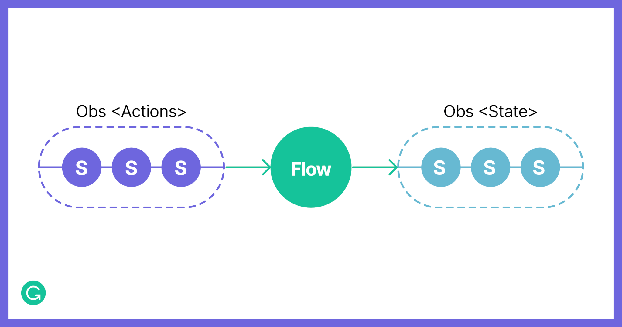
In code, the Flow interface represents a function from an Observable of actions to an Observable of states:
export interface Flow<Action, State> {
  (actions: Rx.Observable<Action>) => Rx.Observable<State>
}
Unlike React’s mount, mounting Embrace’s UI Part will produce a React Element out of a UI Part and matching Flow. The resulting Element will have its re-renders triggered every time a Flow produces a new State. Note that Embrace’s mount will only work if the UI Part has actions and states that match those of the corresponding Flow.
// a button has a string state and can emit click actions
declare const Button: UI.Node<string, 'click'>

// corresponding flow must listen for clicks and produce string states
declare const flow: (s: Rx.Observable<'click'>) => Rx.Observable<string>

// mount will only work (i.e. produce react element)
// if UI Part's and Flow types match
const app: React.ReactElement<any> = UI.mount(Button, flow)
Using Embrace
The job of a programmer using Embrace is to compose an entire application out of small parts into one big UI Part, and to produce a Flow for the resulting application. Embrace helps by providing a set of abstractions and utilities that can be used to define and compose UI Parts and pieces of Flows.
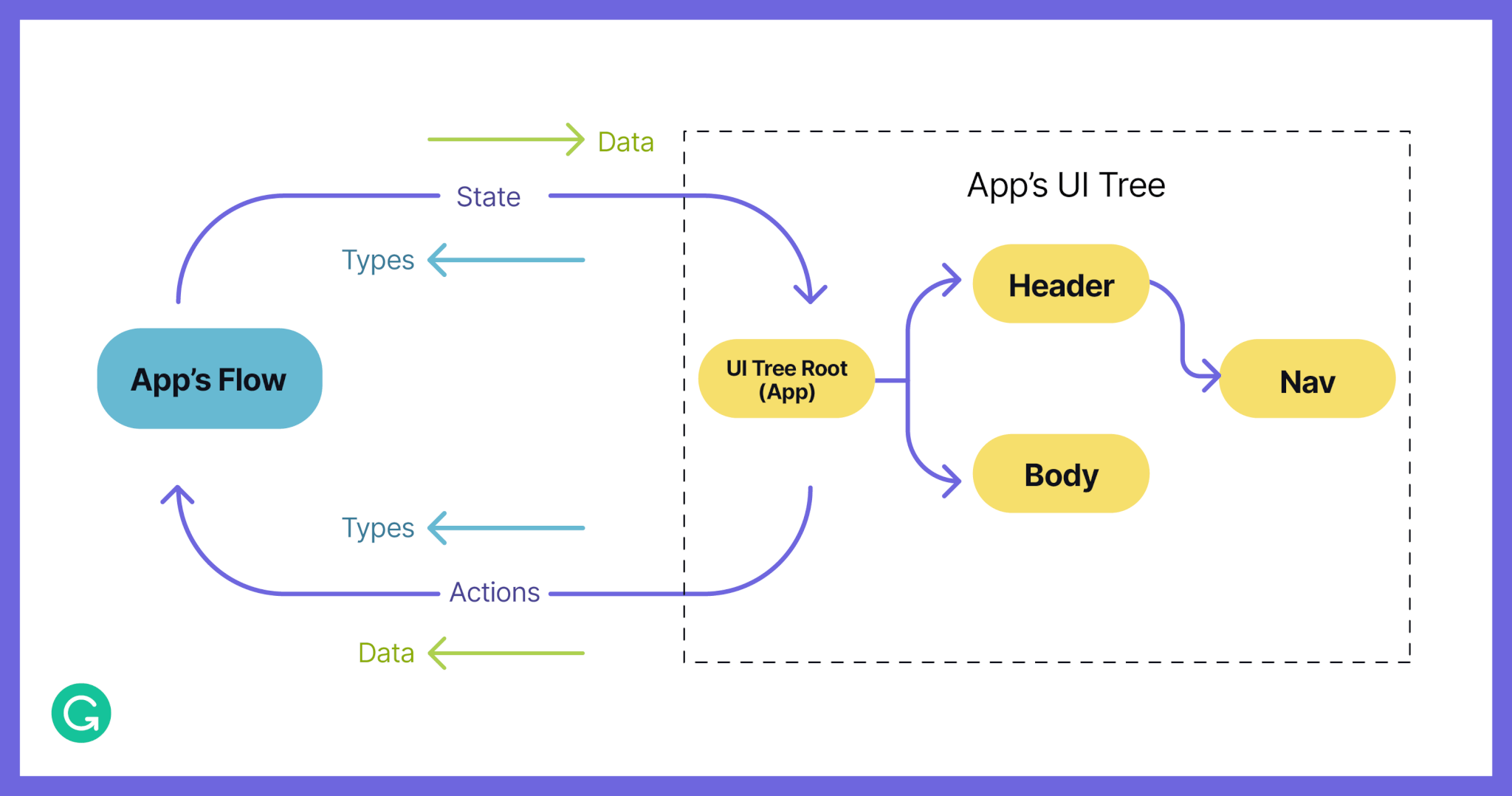
By composing many UI Parts, you can create a single application Flow with Embrace. As data, the app’s UI tree can be easily traversed and modified.
A mandatory “counter app” example
Let’s look at how a counter app can be defined using Embrace:
import { Flow, UI } from 'embrace'

const counterUI = UI.Node.make<number, 'plus' | 'minus'>(({ state, notify}) => (
  <F.div>
    <button onClick={notify('minus')}>-</button>
    {state}
    <button onClick={notify('plus')}>+</button>
  </F.div>
)

const counterFlow: Flow.For<typeof counterUI> =
  (actions: Rx.Observable<'plus' | 'minus'>) => {
  return actions.pipe(
    Rx.scan((acc, a) => (a === 'plus' ? acc + 1 : acc - 1), 0),
    Rx.startWith(0)
  )
}
Here we define a counter view as a UI Node (one of the many kinds of UI Parts that Embrace provides). This UI Node’s state is a number and it can emit a plus or minus action; it cannot have child parts. We use Focal’s React primitives to define the body of the counter UI, where state is an Observable of numbers and notify is a function used to emit new actions.
The flow for such an app will receive an Observable of plus and minus actions and emit new number states. We use standard Rx operators to define a simple flow that will maintain an accumulated number. The flow should always have an initial state value for Embrace to be able to do the initial render of the app, so we start with 0.
// returns React.ReactElement
const CounterApp = UI.mount(counterUI, counterFlow)
Mounting the counter app
Composing and nesting UI Parts
Previously, we discussed how it would be nice to be able to compose components with different states and actions together to automatically produce more complex state and action types. Embrace does just that. When two or more UI Parts are composed, Embrace will automatically produce a new Part, with state and actions reflecting the types of the internal Parts that were combined.
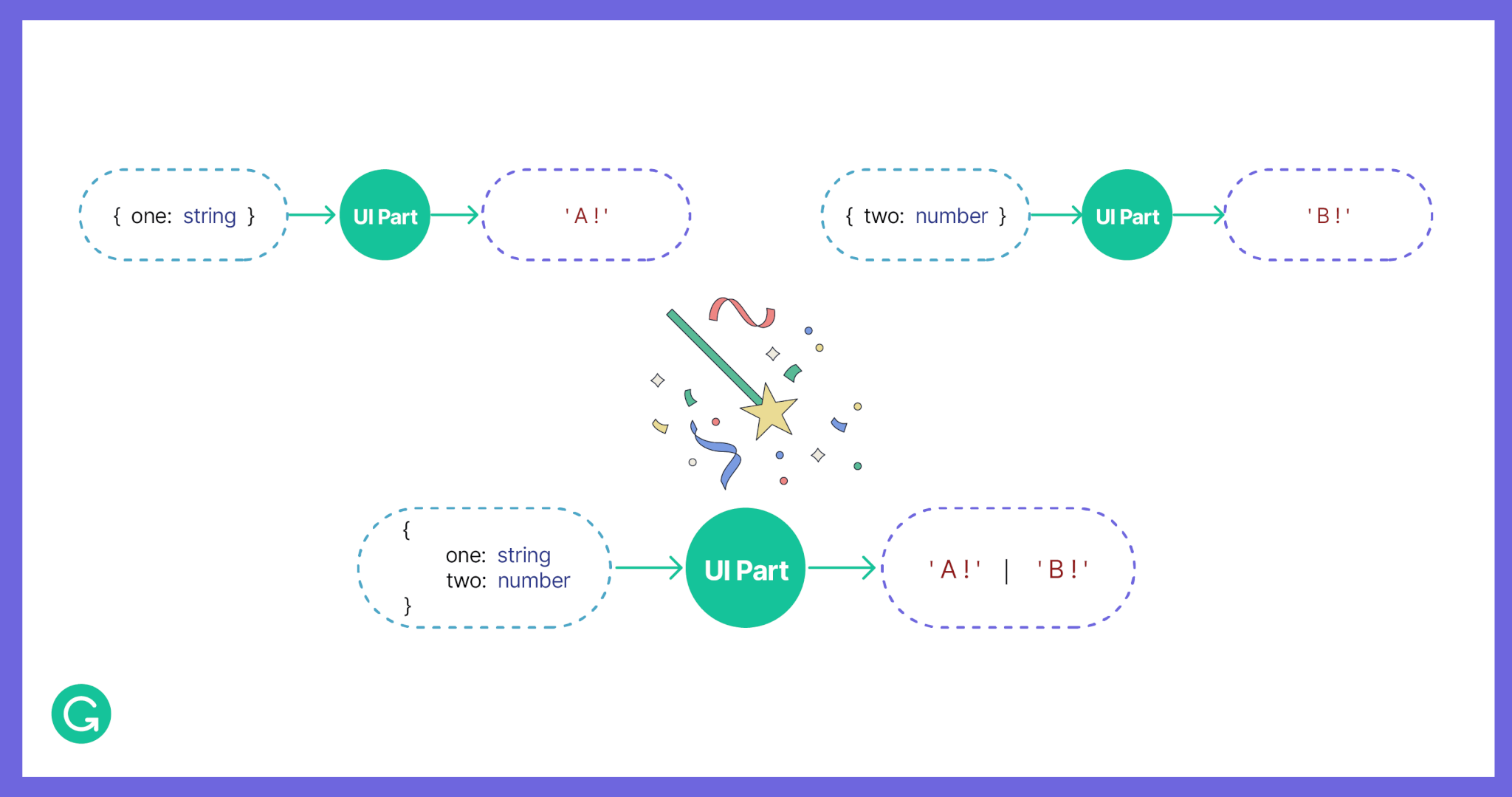
Embrace magically produces a new Part from two or more composed parts, reducing the need for boilerplate code.
There are different ways in which UI Parts can be composed. You may want to render one of the two Parts at a time, or render a list of Parts, or provide a layout with slots where other Parts may fit. Embrace has a number of abstractions that can be used to do this and more.
For example, with a Knot, which is one of the kinds of UI Parts provided by Embrace, you can define an entire webpage. The main component can contain your content as a string. You can emit a scroll action, and you can include two slots, a header, and a footer, which you could fill with other UI Parts that take their own state and emit their own actions.
declare const App: UI.Knot<
  { content: string },
  'scroll',
  {
    header: UI.Node<{ title: boolean; color: string }, 'hover' | 'unhover'>
    footer: UI.Node<{ link: boolean }, 'click'>
  }
>
Embrace then will automatically derive all the different types of the state and actions that the resulting application has, leaving the developer to simply provide a corresponding Flow for the app to work.

When a UI Part is composed of multiple smaller parts, Embrace will automatically include all the types of states and actions in the resulting Flow.
As a result, we no longer need to write code to manually orchestrate state and actions flow through the hierarchy of UI components.
Patching the UI
Until a UI Part is mounted, it can be thought of as a tree data structure. And as data, it can be easily traversed and modified. We call a process of changing a UI Part “patching” as we often need to alter one or more nodes in our app’s UI tree, for example, to implement an experiment.
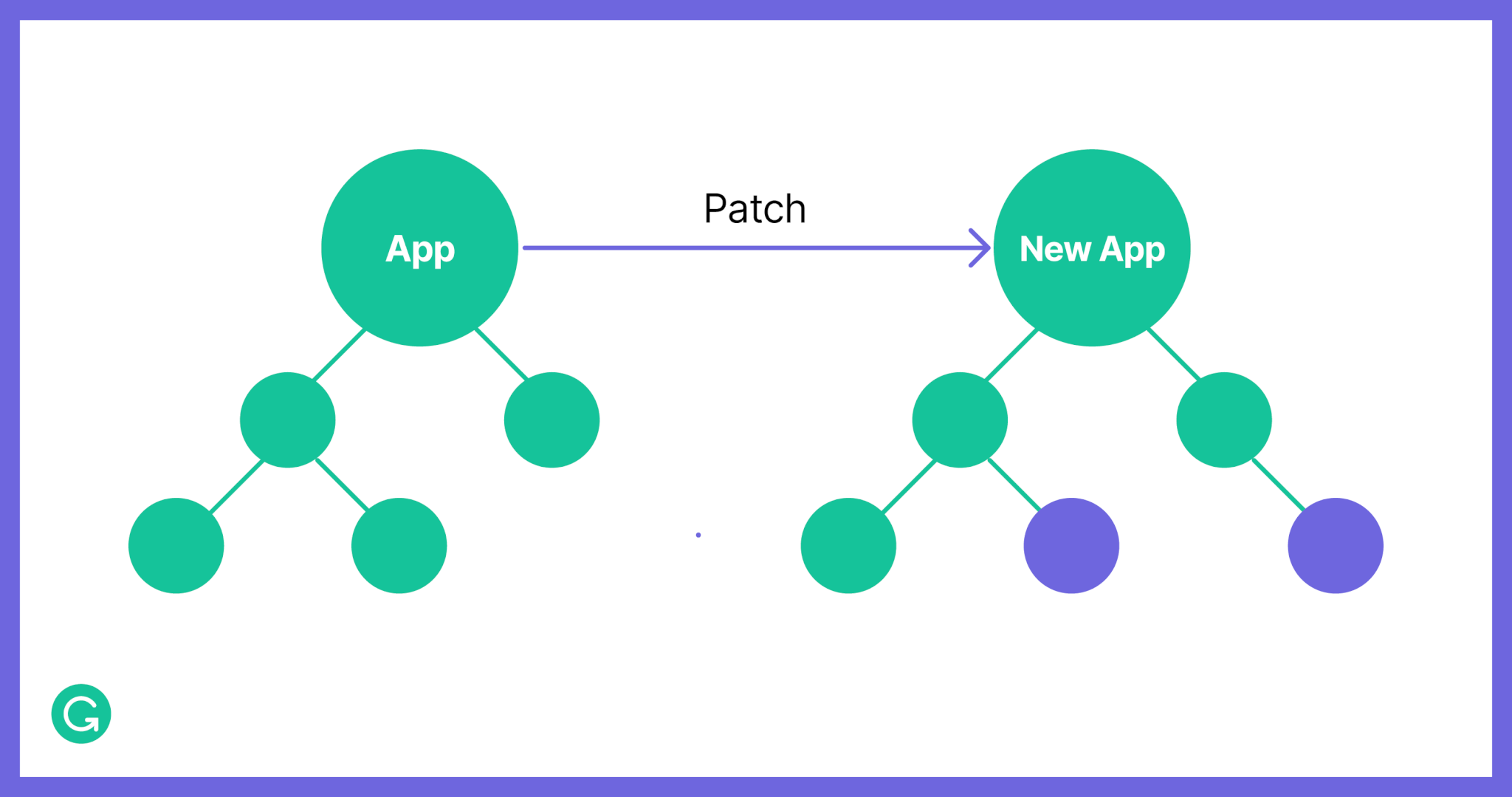
A patch is a pure function from one version of an Embrace app to another.
Returning to the example webpage app from above, what if we wanted to produce another version that would work similarly but without a footer? Embrace’s patch function can do just that, in a type-safe way:
const AppWithoutFooter = pipe(
  App,
  UI.patch('footer')(_oldFooter => UI.Node.empty)
)
The resulting App will contain an empty Node (a kind of UI Part that does not have slots) in its footer, removing the need to provide the corresponding footer’s state and react to its actions when defining the Flow.
Having an ability to “patch” UIs in a type-safe way by providing a function from one version of the UI to another means that now we can define our experiments outside of our main application code.
const removeFooterExperiment = UI.patch('footer')(() => UI.Node.empty)
const anotherExperiment = UI.patch(/*...*/)

// array of all experiments for current users
const appForUser = pipe(
  App,
  removeFooterExperiment,
  anotherExperiment // cannot use footer here
)
Experiments defined as functions on our UI
We can even place these functions in a separate repository, and we won’t have to worry about managing breaking changes, as the TypeScript compiler will help us detect any such changes when updating to a newer version of the package containing the unmodified app. As a result, Grammarly’s Growth team could now implement their experiments without having to touch the code in the Grammarly Editor repository.
Summing it up
We’ve found that Embrace requires a very different way of thinking as a programmer. As a declarative engine, Embrace adds layers of abstraction that require you to take a step back and think through what you’re trying to achieve, rather than just diving in to write code. But that extra thought feels worth it. Embrace lets you make UI code behave almost like a logical equation, with every element completely encapsulated—resulting in front-end code that’s elegant, maintainable, and easily extensible by many teams. We’re excited to be using Embrace today in production to rewrite parts of the Grammarly Editor codebase. That being said, the library is a work in progress, and will continue to become even better with feedback from the community. We hope you’ll find these ideas and the library itself useful, and we look forward to hearing from you on Github!
By the way—Grammarly is also hiring. If you’d like to come build new features to improve communication for millions of users around the world, check out our open roles here.


