At Grammarly, design has been a key focus since our company was founded over a decade ago. We know that to help people communicate effectively, we need to design a product and brand that is trustworthy and delightful. When we reflect on design at Grammarly, four themes come to mind:
- Impact: We design product offerings and features for 30 million daily active users and 30,000 teams worldwide. Whether we’re helping people understand how their tone may be perceived or highlighting the key takeaways from a message, designers at Grammarly are tackling complex and nuanced problems that affect how people express themselves every day.
- Autonomy: At Grammarly, designers have the opportunity to oversee the look and feel of an entire marketing channel, product, or interface. We’re a small team, and managers are here to support you—not the other way around. Maybe this is part of the reason why our designers tend to stick around: Our average team tenure is eight to ten years.
- Vision: We’re in the great position of having a product that people really love and trust. This keeps us humble and also makes it possible to dream big. We’re building tools that support communication and connection around the world—a goal that makes us excited to come to work each day.
- Empathy: It’s one of our core EAGER values to seek out empathy in everything we do at Grammarly, whether we’re interacting with colleagues or responding to user feedback. Empathy is an absolute must for good communication—and good design.
We’re currently hiring for individual contributor and leadership roles across our Design team. Read on to learn more about our story and philosophy, our culture and team, and some of the exciting work ahead of us.
Putting design at the center from day one
Why is design so important at Grammarly? In many ways, it has to do with the delicate nature of the problems we are solving. From the beginning, we’ve been trying to do something utterly new in a highly sensitive domain. To be able to help someone shape what they’re trying to say, you really need to earn their trust. So we’ve always believed that Grammarly can’t just be smart—we need to be graceful, welcoming, empathetic, and engaging as well.
We also have an advocate and champion at the very top of the company. Grammarly’s co-founder and head of product, Alex Shevchenko, personally mentored and managed our Design team for many years. Alex is deeply passionate about how we visually express ideas, not just within our product offerings themselves, but also in all our surrounding marketing and branding. Thanks to this influence, we’ve seen not only product design but also brand and marketing design enjoy an essential role at Grammarly that is only continuing to grow.
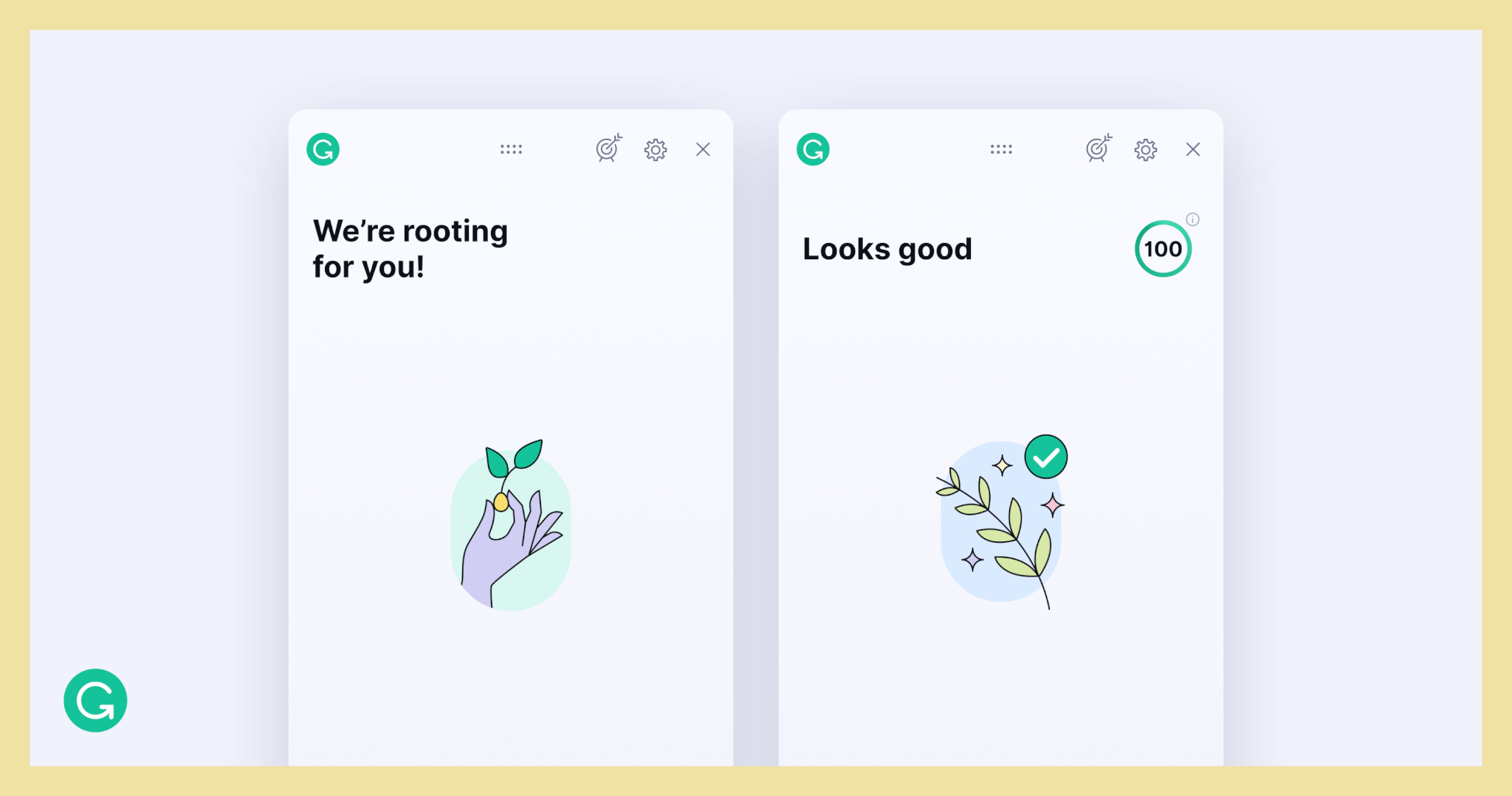
Practically speaking, our design focus plays out in numerous ways. Here’s one example: We try to offer a moment of delight even before someone starts writing or when the product doesn’t yet have suggestions to offer. These moments are referred to as “blank states.” With a seat at the table, the Brand Design team was able to create something engaging that would capture people’s imaginations during these blank states.

Here are some of the designs we created for blank states. On the left is an “empty state,” which appears before someone starts writing, and on the right is a “success state,” which appears after all suggestions have been addressed.
We saw an opportunity to harness design in a unique way. Little did we know that our work would make an unexpected impact: Imagine our surprise when someone recently contacted us through our user feedback channels saying that they enjoyed the “success state” graphic so much that they wanted permission to tattoo it on their body! This might not have been the “product surface” we originally had in mind, but we were honored.
The problems we’re solving at Grammarly
Our writing assistant works across multiple platforms and devices. This means we have to continually balance strategic thinking about improving communication outcomes with a tactical understanding of user interfaces.

One of the things that makes working on design at Grammarly so exciting is that we are defining many patterns and principles for the first time. For example, we’ve used emojis to show the ways someone’s tone may be interpreted in writing—a situation in which they don’t have the luxury of reading the recipient’s face or body language. And we’ve developed a novel UX to suggest ways to make writing more readable and attention-grabbing. Just as we used design to solve the problem of making a blank page be welcoming instead of a scary place for a lot of writers, we approach all of our designs with flexibility and empathy. We also embrace a sense of humor—we had fun joining in when Grammarly recently got its own tribute dance on TikTok, for instance.
The next step for our writing assistant is to continue its evolution toward our vision of a holistic communication assistant. An example of what this means can be found in our approach to Grammarly Business. We’re taking a product that millions of users already know on a personal level and that delivers value on a daily basis, and now we’re strengthening that product into a broader context by asking how we can help professional teams achieve goals through communication. This brings lots of interesting challenges forward.
One challenge is the fact that language is fluid, alive, organic, and never the same in any location. You’ll encounter myriad dialects and variations around the United States alone. On a more specific level, individual companies also have their own language, jargon, and tone. They may have internal style guides to adhere to as well. How do we make sure that these unique attributes are reflected across our communication assistant? We designed company style guides to help our customers respond to these concerns—and we see this kind of personalization as a key part of the future of Grammarly.
Empathetic team culture
These days, we are all increasingly communicating digitally with people who may have very different expectations and assumptions around language. The Design team helps bring a global perspective to the challenges we face as a company. For many people on the team, English is their secondary language (and the same is true of Grammarly’s founders). It’s important for us to build a team of amazing people from diverse backgrounds to design product offerings and experiences that can improve communication for all humans.
Even though we’re distributed all over the world, we prioritize connection, whether by organizing fun poster-design tournaments in Figma or holding regular workshops (most recently one on communication presented by designer and author Mike Monteiro). The tight-knit nature of our team was never more apparent than during the COVID-19 pandemic. Anxiety and uncertainty affected us all, and major life plans flipped upside down. Along the way, we consistently acknowledged the elephant in the room by checking in with each other before every meeting. When one of our teammates faced especially tough circumstances, we took on a special design challenge: making a card of selfies and notes from everyone on the team.
Growing our design organization
Our design organization is divided into four main focus areas: product design, brand design, user research, and design operations. UX writing and content strategy are part of the extended organization as well. We’re hiring for both leadership and individual contributors across the board.
We see design as a multidisciplinary and holistic process integrated with the entire product lifecycle. Designers are embedded in specific functional areas to allow them to specialize. There may be a few designers appointed to one particular product offering or area, and they will be collaborating with product managers, engineers, content strategists, and researchers on a day-to-day basis. The same is true for brand and marketing design. While partnering with marketing operators (for traditional digital performance marketing, brand marketing, and working marketing partners), they also collaborate closely with product teams.
Design leadership at Grammarly adapts to where designers and researchers need support. We meet team members where they are in their career, and provide leadership based on their needs or communication style.
We’re building an amazing team of design leaders. Gianpiero Puleo, the former director of product design at Splunk and former managing director of ustwo in the US, heads up our Product Design team. Jenny Lo, who previously managed user research at Uber, leads our User Research team. Li-Anne Dias, who formerly led brand design at Reddit and Crunchbase, manages our team of brand designers. And we’re only getting started.
Wondering if Grammarly could be the place for you to take your design career to the next level? Check out our open roles on the Design team here.


